Pro-Demnity
ProDemnity is an insurance company based in Toronto, Canada solely focused on providing professional liability insurance to architects in Ontario. The organization had a single shareholder, the Ontario Architects Association which also acts as the regulator, mandating specific levels of professional liability insurance. This was the main reason ProDemnity was formed in 1987 as an organization.
Industry
— Insurance
— Associations
Branding to
— Expand an offering
— Build internal cohesion
— Articulate value
Services
— Brand & value proposition strategy
— Website design & development
— Brand assessment

The Situation
A new CEO had joined ProDemnity who to reinvigorate the brand and the organization both internally and externally. Client research showed that the brand had value in its understanding of architects, their practice and the risks they face. However, architects felt their professional liability insurance premiums were too high and didn’t see the value ProDemnity delivered for those premiums unless they had been supported by them through a claims dispute.
Human Catalyst
Architects’ practice risk was increasing, leaving them exposed to insurance claims, potential reputational damage as well as they weren’t supported beyond their insurance coverage with ProDemnity.

The Solution
Through our engagement with staff, we discovered a deep passion and purpose for helping architects while being knowledgeable and empathetic to their challenges. This strength aligned with what architects needed and wanted, a partner who had their best interest at heart. These insights led us to a brand strategy that positioned the brand as an “ALLY” for architects, one that promised to protect and defend them, leveraging our knowledge of risk and stature within the legal community to back them up in the event of a claim. This led to the creation the tagline – An alliance for protection.
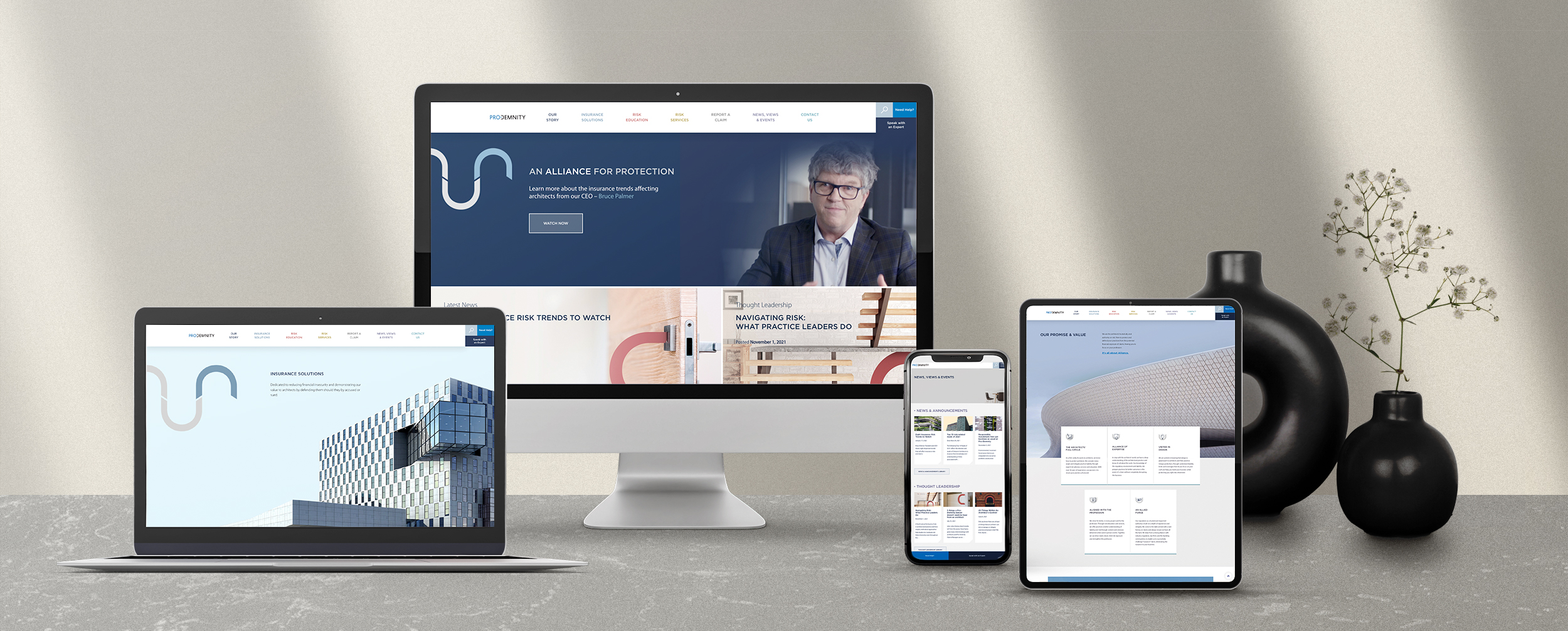
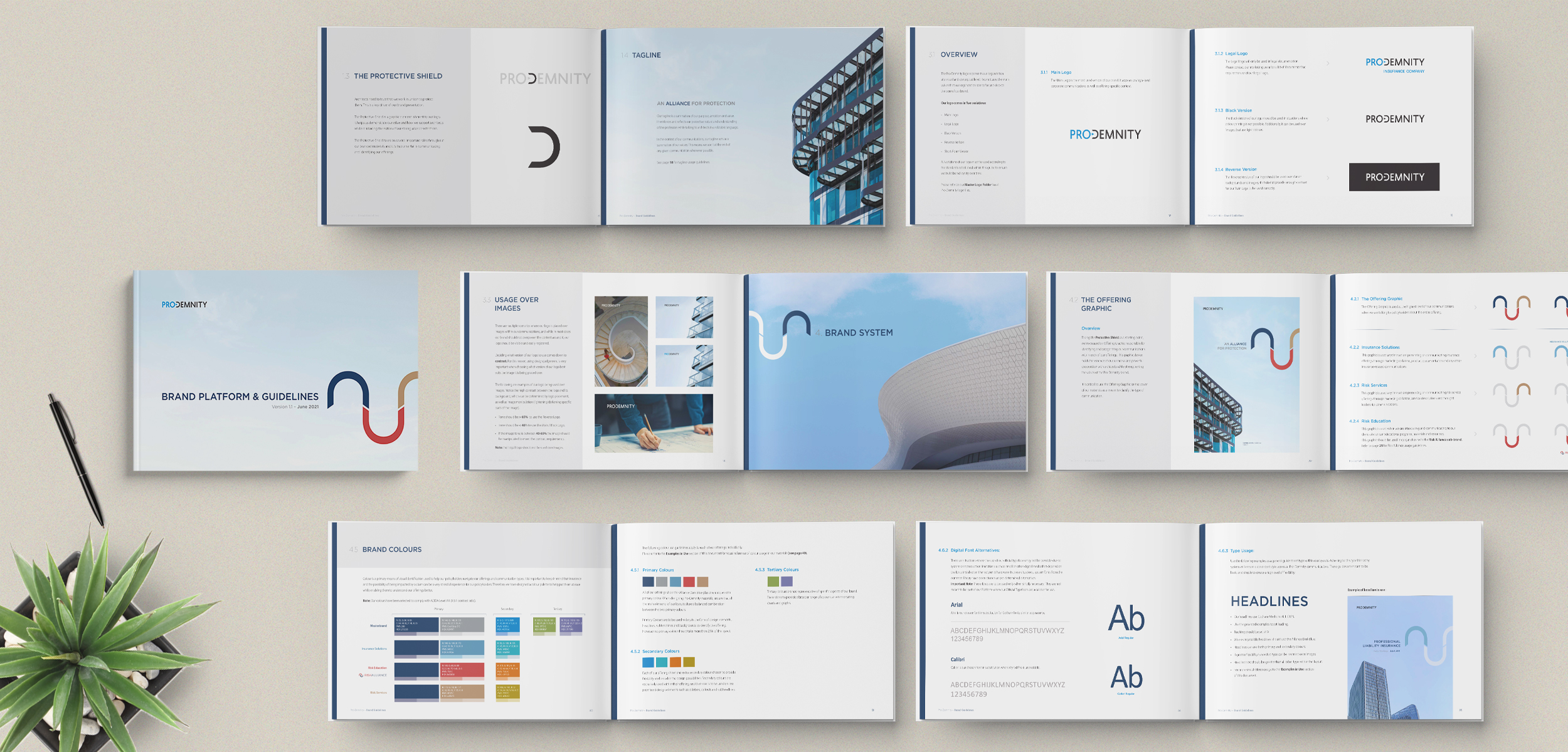
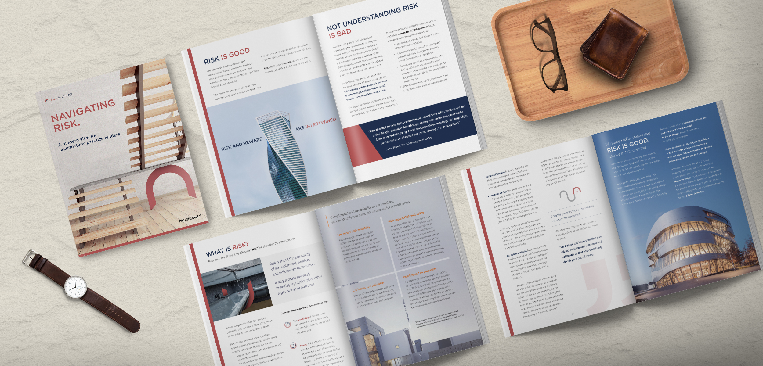
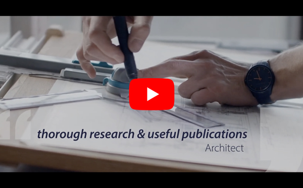
Our creative solution worked to re-enforce the alliance by using imagery sourced from architects’ projects with photo credits, and leveraging the key graphic element in the logo as a symbol of protection – “the protective shield” along with alliance-based language and a new sub-brand for risk education call “Risk Alliance”. All these elements came together to re-enforce our purpose as an organization and the value we bring when protecting and defending architects. The brand launched with a new corporate website, brand video, extensive case study library, thought leadership content and comprehensive brand guidelines to ensure consistent delivery of the brand at every touch point.

The Yield
One of the key objectives for the initiative was to drive deeper engagement with the brand and its knowledge base surrounding risk and risk management. After launching the brand and the new corporate website, engagement metrics more than doubled which included traffic to the website, access to and consumption of educational content, requests to speak at events and a shift in client interactions toward more consultive engagement.
Testimonial
“We’re conservative by nature, but Brad challenged us and pushed our thinking to adopt newer approaches.”
Iliana Arapis, V-P Marketing


